Fresh cuts for the meals people gather around.
A butcher-counter story that should feel honest, flavorful, and dependable — not corporate. Use warm reds, clean product photography, and direct calls to cook tonight.
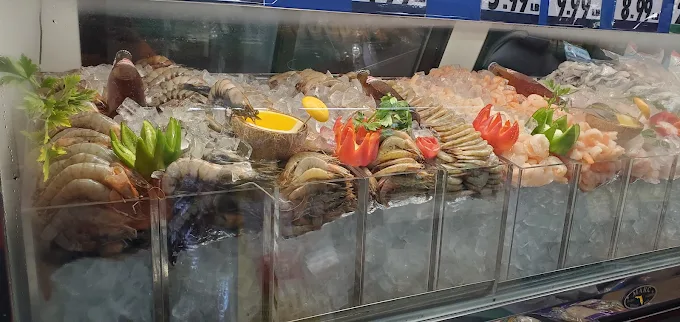
Ask what is fresh todayFresh cuts from the carnicería, colorful produce, warm pan dulce, hot food, seafood, snacks, and everyday groceries — brought together with the warmth and flavor of a true mercado.
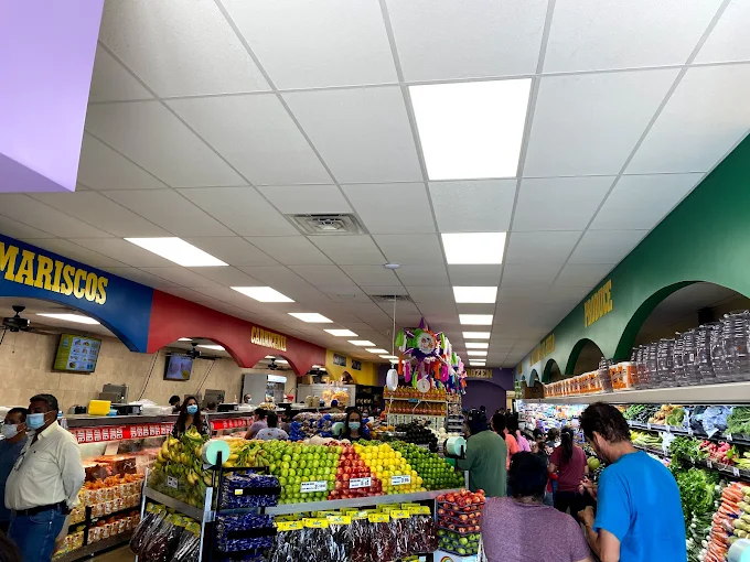


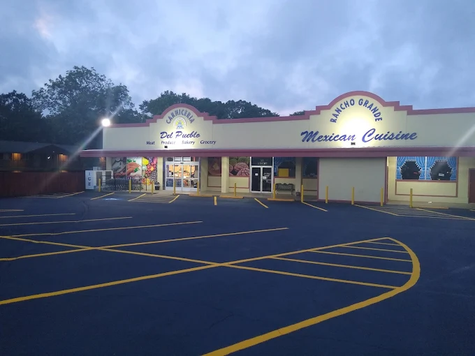
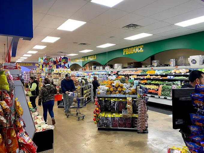
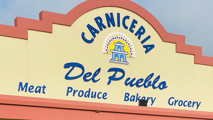
This v1.1 direction moves away from generic grocery design and into something more personal: the storefront arches, the blue lettering, the colorful interior signs, the fruit displays, the bakery case, and the prepared food counter all become part of the website’s visual language.
Instead of hiding text over a dark photo, each department gets its own high-contrast card, custom icon, warm copy, and image-backed detail.
A butcher-counter story that should feel honest, flavorful, and dependable — not corporate. Use warm reds, clean product photography, and direct calls to cook tonight.
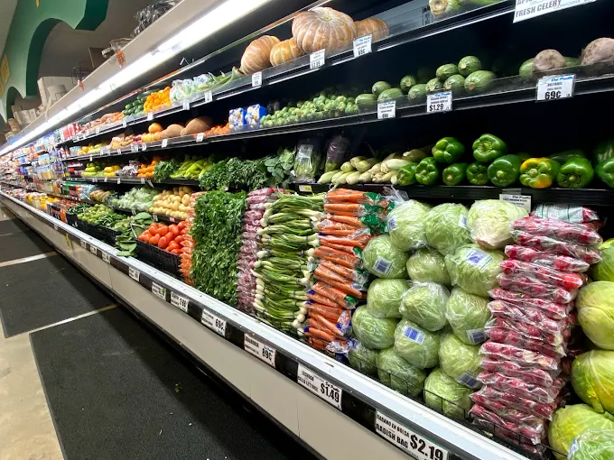
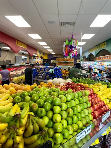
Ask what is fresh todayFruit and vegetables should carry the page visually: green apples, bananas, peppers, citrus, cabbage, and wall displays become the site’s living texture.
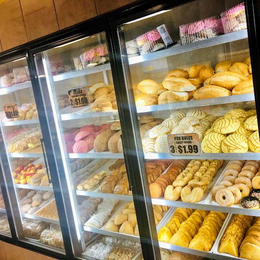
See the market colorThe bakery area should soften the design with cream, gold, and close-up imagery. This is where the site becomes inviting, familiar, and craving-driven.
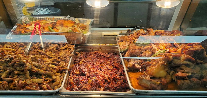
View bakery inspirationThe hot counter is a conversion tool: make customers hungry, make it easy to call, and make the experience feel like a local favorite.
Call the storeThe direction should feel immersive and memorable, but grounded in the real store. We use narrative blocks, photo cards, tactile patterns, and short human copy so visitors can almost hear the carts, see the produce, and smell the pan dulce.


707 S Jackson St, Jacksonville, TX 75766
Open daily, 7:00 AM – 9:00 PM